
Thursday, someone writes “can we get a logo vibe.”
They mean a mark for the repair cafe. They also mean an app icon. They also mean a pattern for the wrapping paper. If you give them one file, two of those jobs will come back.
/logo, /icon, and /vector look related because they all want a clean graphic. They fail in different sizes.
/logo is one brand mark. /icon is a pictogram that survives a small size. /vector is a graphic you can keep editing — a pattern, a diagram, a sheet — not a photograph pretending to be simple.
Finish all three in the Design Editor. Do not let Thursday become a new identity system you did not ask for.
The thread at the bottom is one conversation. First the mark. Then the icon, attached with @out:.
One mark, no letters
A neighborhood repair cafe needs a thing people can stitch on a tote. Wrench. Leaf. One emblem. Not a paragraph. Not the hours. Not the word “REPAIR” in a font the model invented.
Design a simple geometric logo mark for a neighborhood repair cafe: a wrench and a leaf combined into one abstract emblem. Flat color, cream background, no letters or numbers.
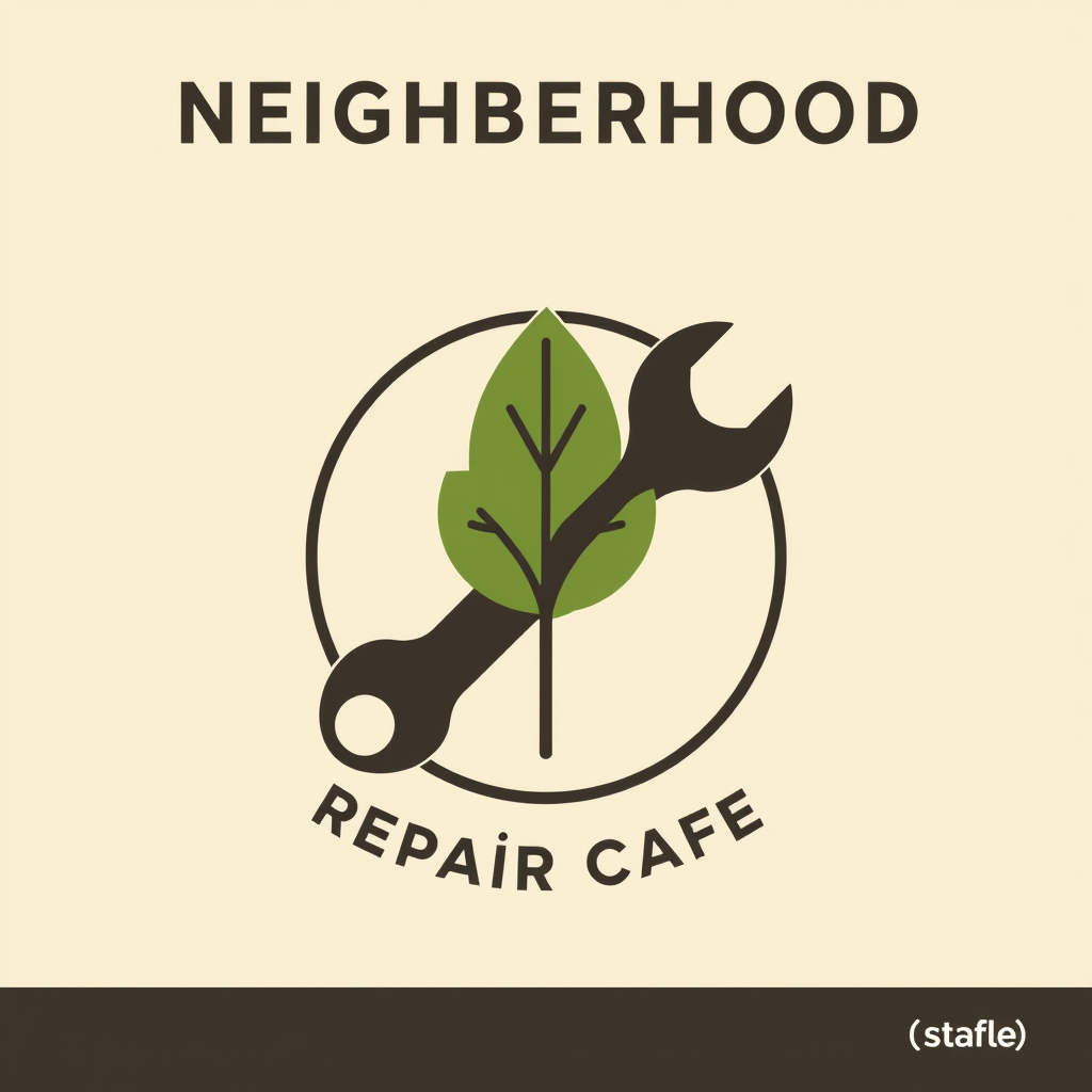
If letters appear, they are not your name. You cannot kern a photograph of a lie. Keep the wordmark native. That is the same reserved-field honesty as poster, flyer, or banner.
A logo is not a campaign. It is not a sticker sheet. It is not a mascot with a biography. If you needed those, you needed another command.
A pictogram has to work at 24 pixels
The same cafe now needs a tab icon. The wrench-and-leaf still has to read when it is tiny. Detail that was charming on a tote becomes noise on a phone.
Do not shrink the logo and hope. Ask for the reduction, and point at the mark you already accepted.
Distill the accepted mark into a simple pictogram that stays clear at 24 pixels. One shape, no letters.
@out:repair-mark is the previous result. The icon should be a child of the mark, not a cousin who never met the family.
One shape. High contrast. No tiny veins on the leaf. If you need a set of icons for a menu — home, book, bag — say it is a set, and keep them one family. That is still /icon, not a new /logo for every noun.
A vector is the file you will keep opening
/vector is the command when the artifact is a graphic you will keep editing as paths: a seamless pattern, a diagram, a sticker sheet, a badge that is not the new logo.
Design a seamless cream-and-leaf pattern for wrapping paper. Simple repeats, no letters, no fake brand.
A diagram that has to stay a diagram — boxes you can still move — is /vector, not a screenshot of a slide. A screenshot is a picture of thinking. You cannot rearrange it.
If the job is a photograph of a shoe, you wanted /image or /asset. Vectors are not a style filter you pour over a product hero.
The identity pile-up
The expensive Thursday is always the same. Someone asks for “the logo.” You get a poster. Or an icon with a slogan. Or a pattern with a fake wordmark baked in. Then the tote, the tab, and the wrapping paper all fight.
Ask this first:
Where does it live?
- On a sign, a stamp, a profile →
/logo - At 24 pixels, in a tab or a list →
/icon - As a sheet, a pattern, a diagram you will keep editing →
/vector
Must the letters still move?
If yes, do not put them in the pixels. Ever.
The rest of the map is the command list. The language is What AskGL is. If you are choosing a route for the mark, read How to pick a @promptha model. Public aliases stay @promptha.*.
Then open Ask. Make the mark. Accept it. Ask for the icon with @out:. That is how Thursday stays one identity.
Frequently asked questions
Should the shop name be inside the /logo image?
No. Letters in the pixels are not your name. Keep the wordmark native in the Design Editor.
Can I shrink a logo into an icon?
You can shrink the file. You will lose the job. An icon has to read at 24 pixels. Ask /icon for that reduction, and attach the accepted mark with @out:.
Is a sticker sheet a logo?
No. A sticker sheet is /vector — a graphic set you can still edit. A campaign badge is also not a new identity.


